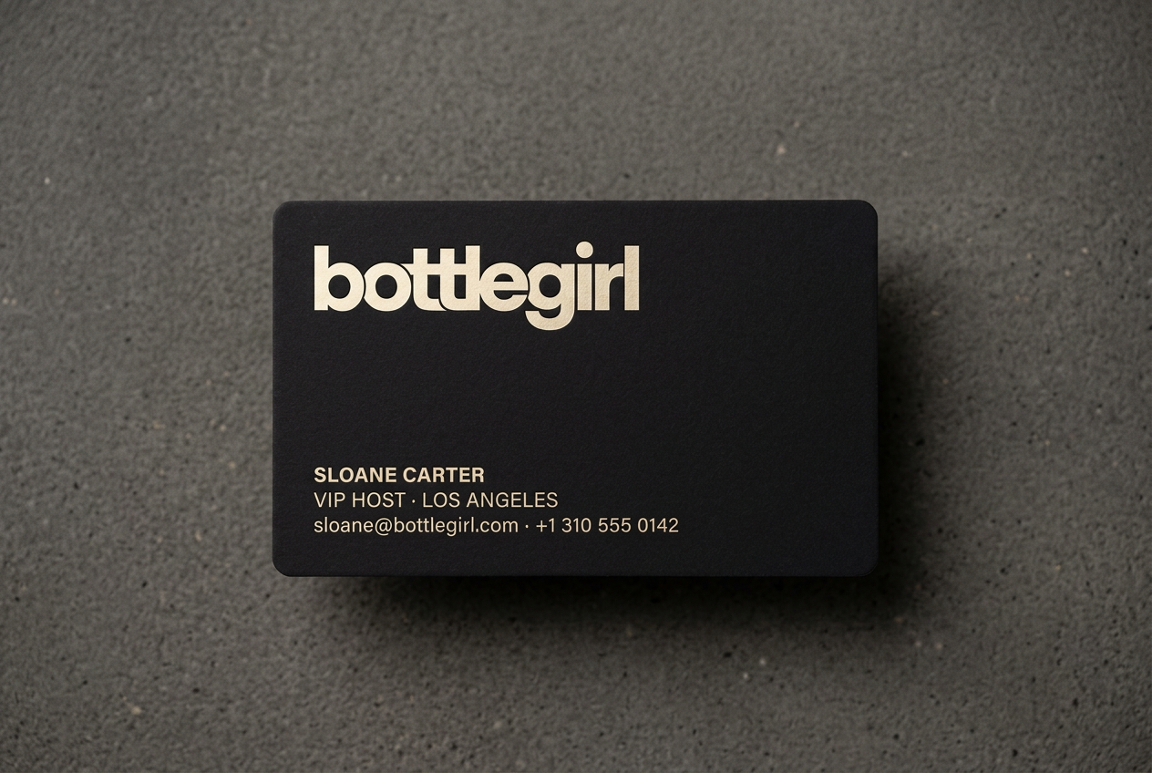
A platform for the night, the moment, and everything between.
BottleGirl is the modern platform for premium hospitality: table service, ticketing, nightlife, day parties, concierge, and curated experiences. We connect the venues people want with the access they expect.
From the lounge to the rooftop, from the resident DJ to the private suite, BottleGirl is the layer that makes a night feel intentional. Booked in seconds. Confirmed with confidence. Remembered for years. This book defines how the brand looks, reads, and behaves across every surface it touches.
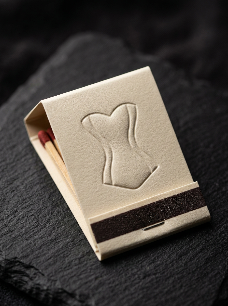
presence, shaped in a single line.
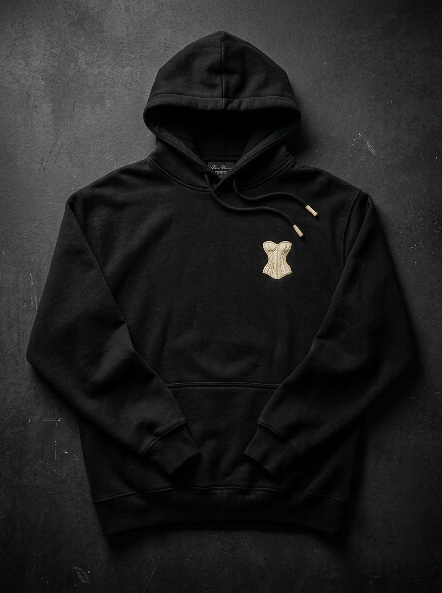
The corset has long been a symbol of confidence, close to the body, close to the voice. Our mark reduces it to its essential silhouette: a curved band, a clean lacing, a single drop. It speaks before words do. The wordmark is set in a quiet, deliberate lowercase, an invitation rather than a shout. Together they read as a brand that is in the room, not announcing it.
A family of marks, one signal.
The BottleGirl identity is a coordinated system. Each mark is built for a specific surface, a specific scale, and a specific moment. Use them with intent. Never recreate, redraw, or rearrange the artwork.
confidence, shape, access, presence.
The corset icon and bg lettermark are the brand at its most distilled. The corset silhouette signals confidence and shape. The lettermark stamps access and presence. Together they extend the brand into avatars, app icons, foil prints, and any space too small for the full wordmark.
- — Always render at 100% opacity.
- — Maintain stroke weight; never re-trace by hand.
- — Pair with one wordmark at most per surface.
one wordmark, four backgrounds.
The wordmark follows the same contrast law as the corset. Render it solid black or solid white. Never recolor the wordmark in gold; gold is held for the corset, the accent rule, and the highlight word.
- — White wordmark on black, charcoal, or imagery with a deep base.
- — Black wordmark on white or gold.
- — Never set the wordmark in gold, charcoal, or any color outside the palette.
when the marks travel together.
When the corset and wordmark appear in the same lockup, treat them as a single composition. The two marks always share the same color family on light surfaces and may split into a two-tone treatment on dark surfaces, where the corset carries the gold accent and the wordmark remains white.
- — On black or charcoal: corset in gold, wordmark in white.
- — On white: both marks in black. Never split into two colors on white.
- — On gold: both marks in black. Never set the corset in white on gold.
- — Maintain the built-in spacing between the two marks. Do not resize them independently.
- — One lockup per surface. Never repeat the combination mark within the same composition.
Give the mark its room.
Clear space is measured in units of x, where x equals the cap-height of the lowercase b in the wordmark. A minimum of 1x must surround the mark on all sides, free from type, imagery, edges, or other graphic elements.
Small enough to fit. Large enough to feel.
Below these thresholds, the artwork loses fidelity and the brand loses authority. When in doubt, scale up.
Four colors. One mood.
Black and white dominate the brand system. Black for surface and presence, white for clarity and contrast. Charcoal carries depth and panel work. Gold is the accent, reserved for moments that deserve attention.
A rough guide for how the palette should sit on any composition.
How the marks meet the surface.
Tonight, the room is yours.
Reserve gold for one or two words per composition.
Never place gold type on white, nor charcoal type on black. The brand earns its authority through high-contrast pairings.
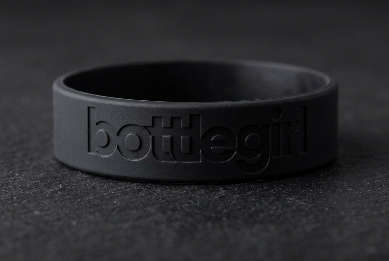
One typeface. Total command.
Used across every surface: print, screen, signage, and motion. Weights: Light · Regular · Bold. Default to lowercase for headlines; mixed case for body and editorial paragraphs.
The rules that keep the brand whole.
- 01Use the original artwork. Never recreate or redraw.
- 02Maintain clear space on every side of the mark.
- 03Scale the artwork uniformly.
- 04Keep the mark upright on every surface.
- 05Use EPS for print, SVG/PNG for digital.
- 06Pair the mark with high-contrast backgrounds only.
On screen, the brand stays restrained.
In the room, the brand is felt before it is seen.
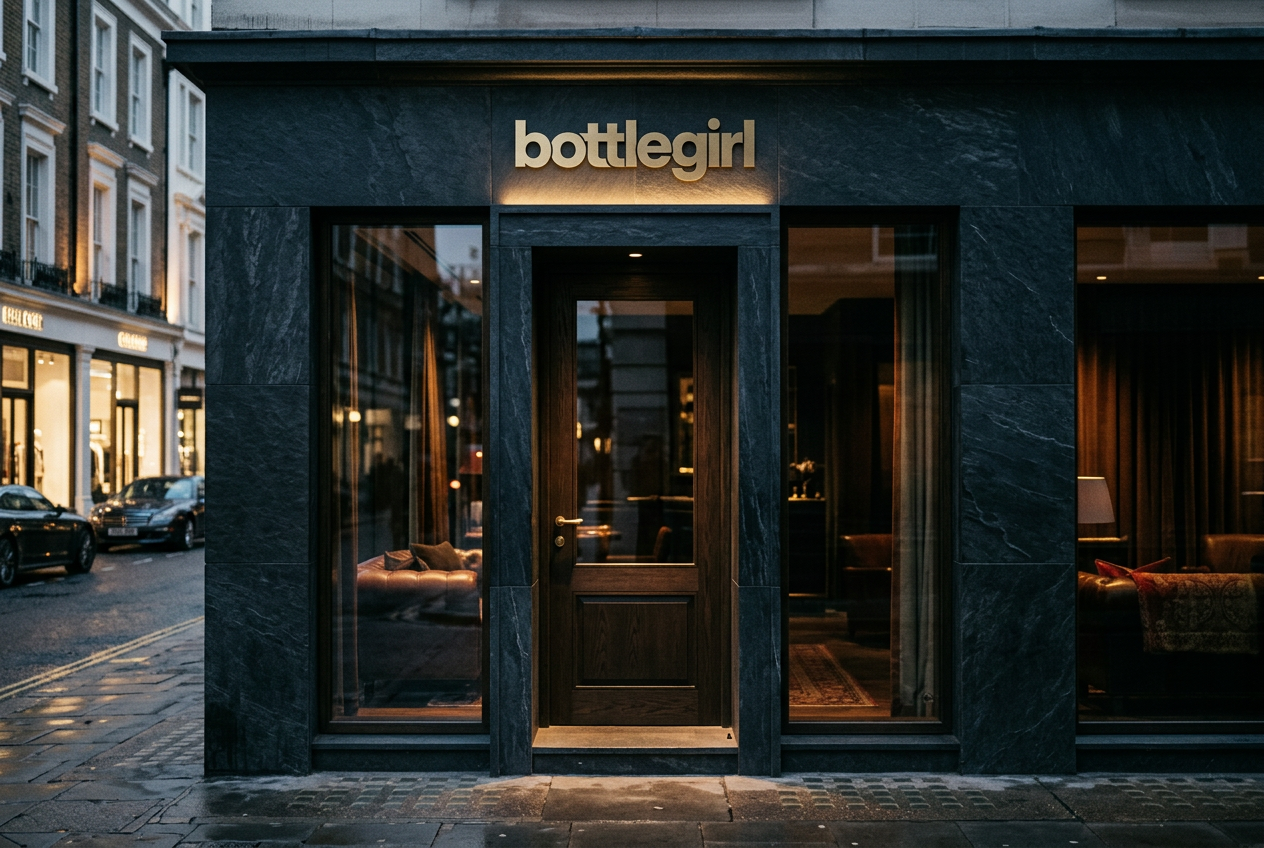
the brand lives in the moments it isn't loud.
Use this book as a starting line, not a fence. Every detail in it exists to protect one thing: the feeling of being inside BottleGirl.